Analytics dashboards: chart data from across your stack
TLDR
Create editable charts from existing databases, data warehouses, SaaS tools, pipeline outputs, and more in one Mage Pro workspace.
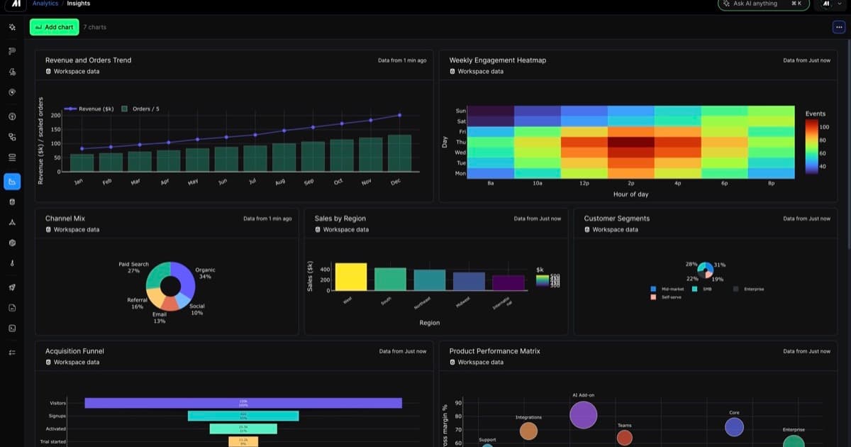
Turn data from across your stack into usable insights
Mage Pro Analytics lets teams create, arrange, and revisit charts from the data they already use, including existing databases, data warehouses, SaaS tools, and pipeline outputs. Build the view in the same workspace where your team explores, transforms, and operates that data.
Make the data easier to use
Create a dashboard from the results that matter to the work: trends, distributions, tables, metrics, and other supported data shapes. The result is a practical view for checking what changed, sharing a result, or deciding what needs attention next.
Keep each visual tied to its source
- Chart data from across your stack. Start with an existing database, data warehouse, SaaS tool, or pipeline output instead of rebuilding the analysis somewhere else.
- Ask for the view you need. Use AI Sidekick to help turn supported output into a chart and refine the result in Mage Pro.
- Keep an editable record. Dashboard charts remain connected to their source and workspace context, ready to revisit as the data or question changes.
Give operating teams a shared view
Analytics dashboards help teams move from available data to a useful answer without adding another handoff. It is a simpler way to keep insights visible to the people who need to use them.